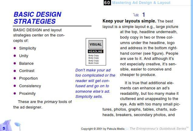
There are all kinds of designers.
Landscape, advertising, architectural, fabric . . . you get the idea;)
While each designer has a very specific skill set that categorizes them as an expert in their field,
all of us follow a very simple and similar set of rules.
Let's consider print advertising for a moment.
Here is an ad I got in the mail the other day.
There is balance with the images.
Different sizing of the fonts to create emphasis.
The text is spaced appropriately for the space.
There is simplicity in the message.
The images are coordinating colors and the purple text is different to accent the message.
These were my thoughts but I thought I would look to an expert to confirm my ideas.
of Basic Design Strategies which can be used for creating promotional materials.
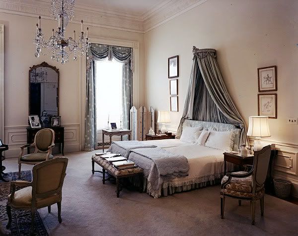
Let's apply these rules to a beautiful room.
Here is the Presidential Master Bedroom of Jackie & John F. Kennedy.
We can find each design principle in this room.
Simplicity: This room isn't too crowded with furniture or decoration.
Unity: All of the colors used are similar and the pieces of furniture are complimentary.
Balance: All of the furniture is evenly distributed on either side of the bed.
Contrast: To keep the room from looking too uniform, the furniture on each side of the bed is different. Additionally, the carpet to the left contrasts the wall-to-wall carpet to create a space within a space.
Proportion: Since the ceilings in this room are so high, the headboard and the vanity mirror are very tall to keep the rest of the room in proportion.
Consistency: This ties in with the Unity principle. The colors and patterned fabric are used throughout the room creating a theme.
Proximity: Furniture placement is placed appropriately to the size of the room and it's function. The bed is prominently placed in the center as well as the seating area to the left (which happens to be in front of the fireplace.) This makes the main functions of the room central and paths of movement to the outskirts.
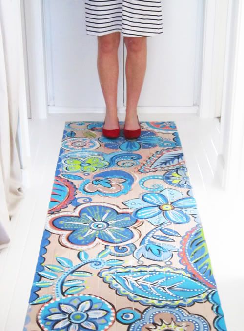
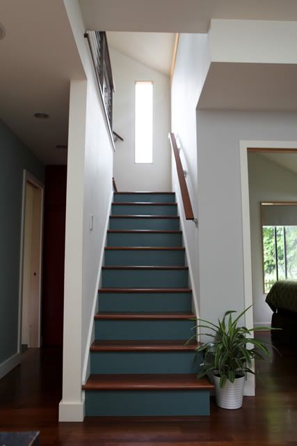
The simple rules outlined above can be applied to any type of creative endeavor.
Creative is the keyword here. While the rules are simple sometimes the creativity is hard to find:)
Exercise your creative juices and try applying these design principles to your home!
If you end up with something you like, send me a picture:)